Ev'ry.
Client
Ev’ry
Industry
- Health and Wellness
Services
- Logo Design
- UI UX
- Visual Identity
Year
2026
About
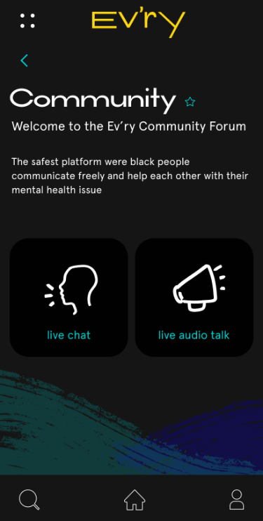
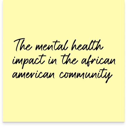
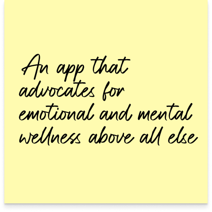
I designed Ev’ry as a culturally responsible mental health experience tailored to the African-American community, addressing gaps in access in traditional care systems and a focus on building community.
My role spanned end-to-end product design, where I translated culturally specific user needs into a safe, empowering digital environment that encourages consistent self-reflection and emotional wellness.
PROJECT
overview.
problem
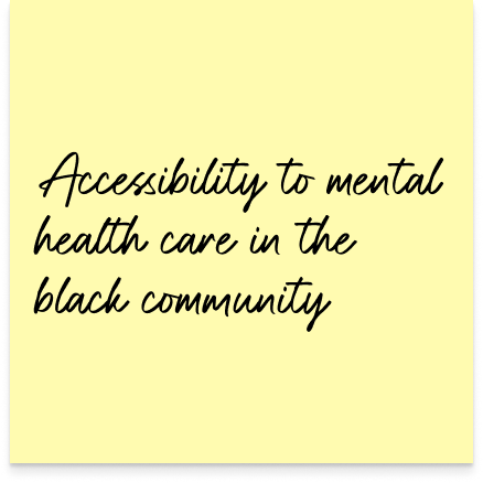
The African-American community faces a significant gap in mental health awareness, compounded by cultural stigma and a lack of trust in providers who may not share or understand their lived experiences. This results in lower engagement with mental health resources and fewer opportunities for early intervention and ongoing care.
goal
By offering tailored educational content, self-guided wellness tools, and an inclusive user experience, the app aims to increase mental health awareness and encourage sustained engagement. Success is measured through user growth within the target community, retention over time, and positive user feedback that reflects increased comfort and value.
Overall goals were to design an intuitive, trustworthy mobile experience that:
- Encourages mental health awareness
- Reduces stigma around self-care
- Provides accessible, self-guided wellness tools
- Builds long-term engagement through relatability and ease of use
research
and insights.
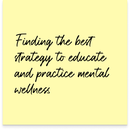
User behavior in wellness products shows that engagement drops when experiences feel overly clinical, complex, or impersonal. From research and user-centered thinking, key insights included:
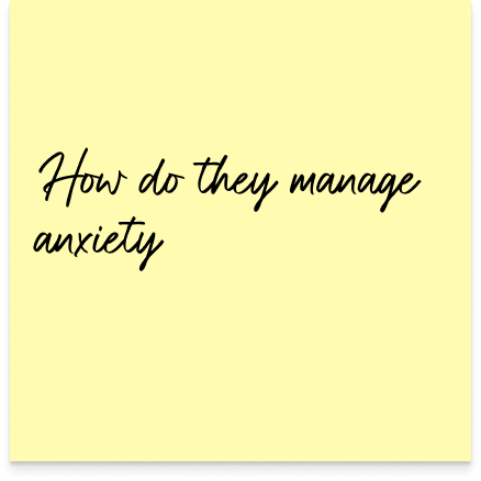
- Users prefer private, self-guided tools before seeking professional help
- Relatability and representation directly impact trust and engagement
- Simplicity and emotional tone are critical for reducing friction and intimidation
solution.
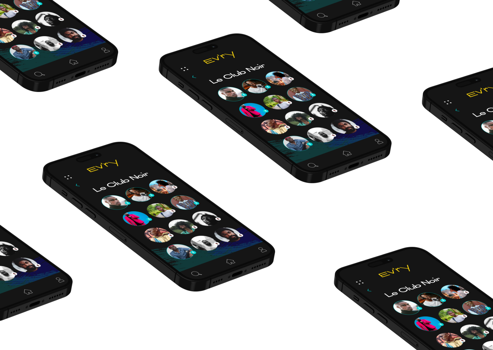
I designed Ev’ry as a culturally intentional mental wellness platform centered around simplicity, emotional safety, and accessibility. Core experience decisions included:
- Guided onboarding to ease users into mental wellness without overwhelm
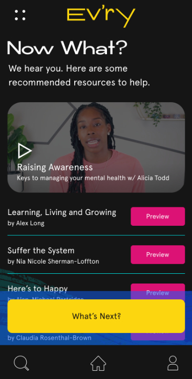
- Self-help tools (affirmations, journaling, educational content) to support independent care
- Culturally relevant visuals and tone to build trust and relatability
- Streamlined navigation to reduce cognitive load and encourage repeated use
user
flows.
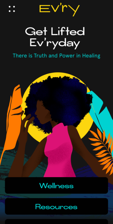
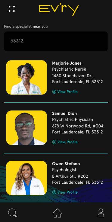
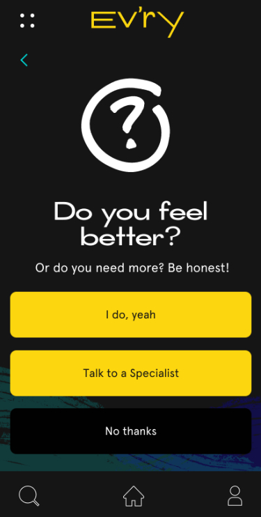
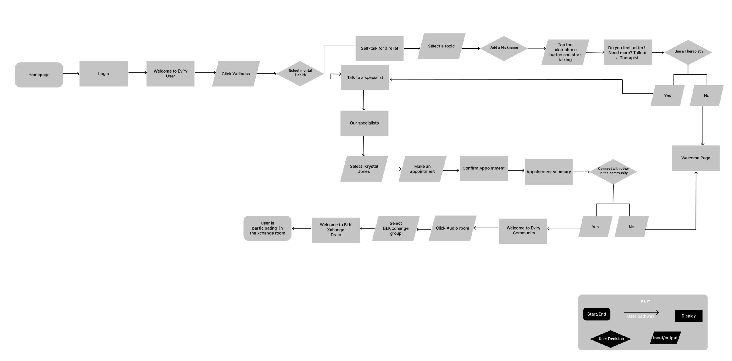
The user flow was designed to balance autonomy with guided support, allowing users to choose their level of engagement based on their emotional needs in the moment. From the homepage, users are quickly funneled into the wellness section, where they can either engage in self-guided relief (such as affirmations or voice-based self-talk) or escalate to professional support.
Branding
Comparison.
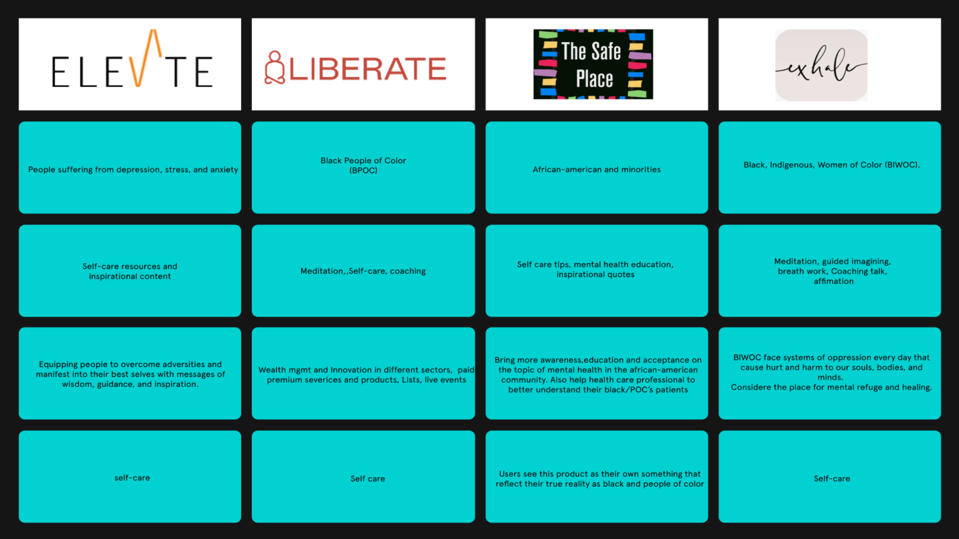
The branding comparison was conducted to identify gaps and opportunities within the existing mental wellness landscape, particularly for products targeting Black users. While many competitors offer self-care tools and educational content, most position themselves broadly or lack a deeply culturally specific experience.
Through this analysis, I identified that few platforms fully center the African-American experience in both content and brand perception. Existing apps tend to fall into either generic wellness or broadly inclusive categories, often missing the nuance needed to build trust with this audience.
moodboard.
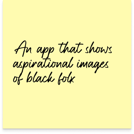
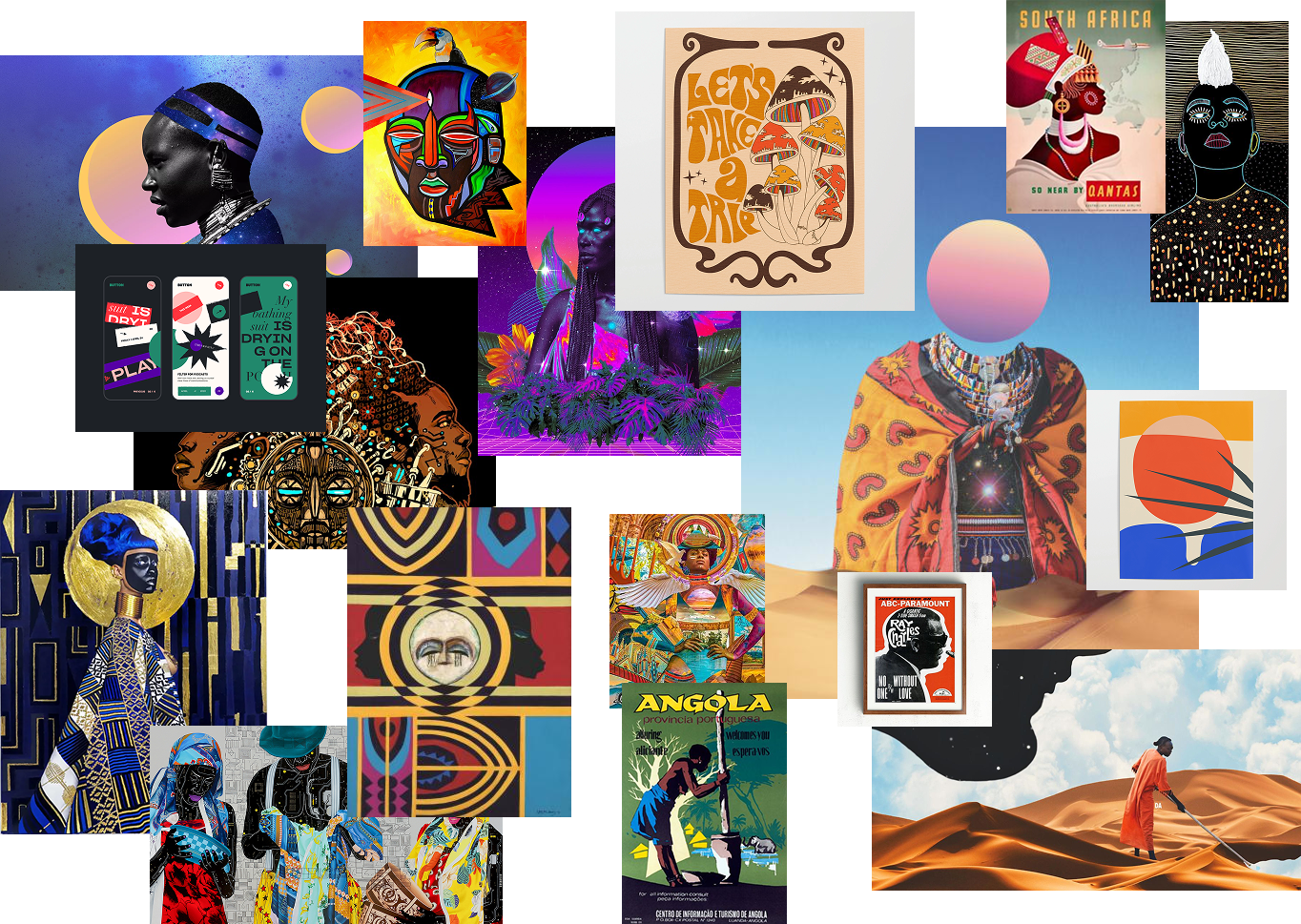
The moodboard explores a rich visual language rooted in African and African-American art, culture, and identity. It pulls from a mix of traditional patterns, contemporary illustration styles, and vibrant color palettes to create a sense of depth, pride, and individuality.
A key intention behind this direction was to avoid the overly minimal, clinical aesthetic commonly seen in wellness apps. Instead, I leaned into bold color, expressive typography, and culturally inspired visuals to create an experience that feels alive, empowering, and emotionally resonant.

Color
Palette.
Color Story
Vibrant and Open
#FCD60E
#00D1D1
#DC1374
#FF7A00
#151515
custom
illustrations.
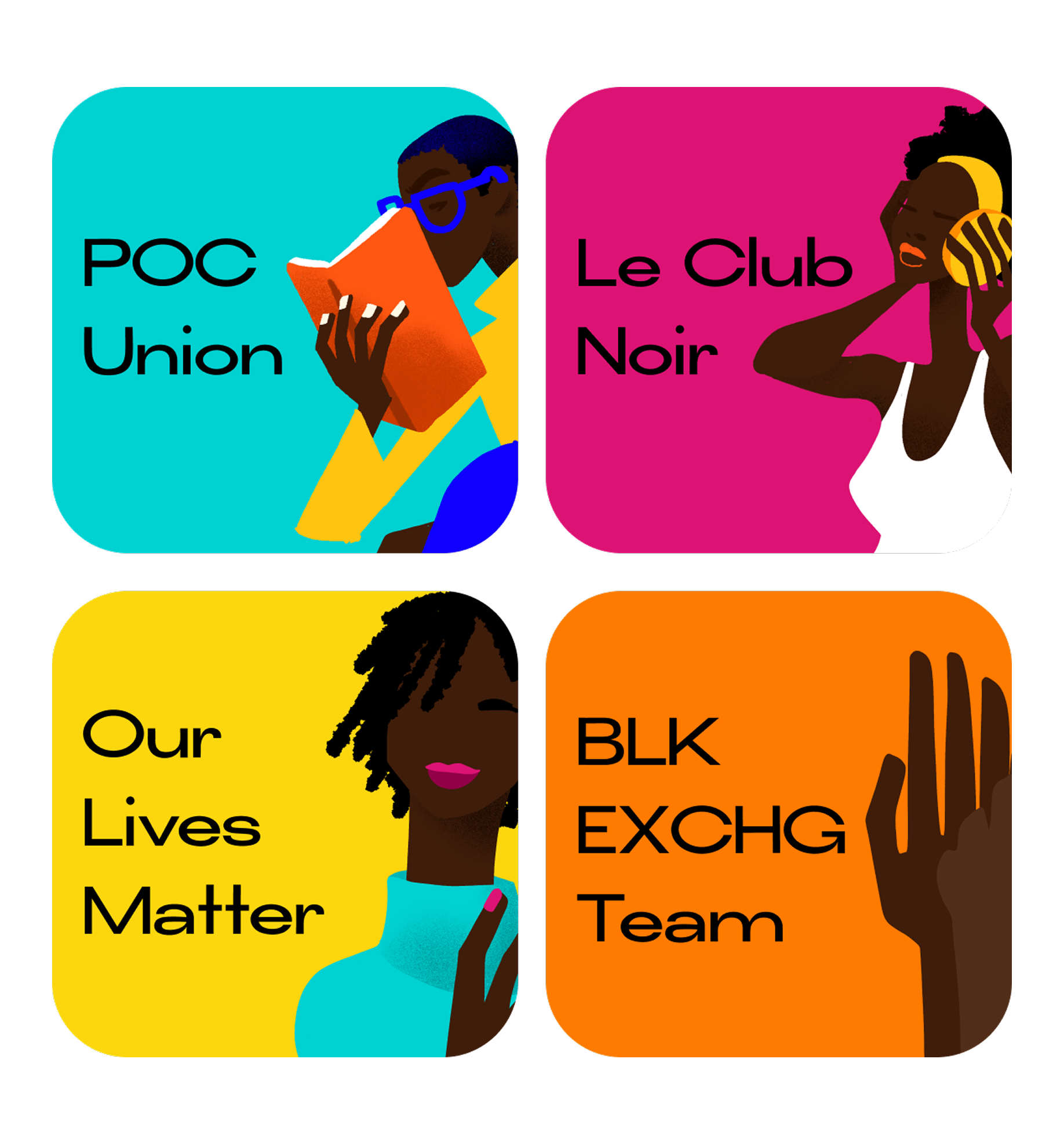
Rather than relying on stock imagery, I created a series of custom illustrations with characters and scenes designed to reflect the identities and lived experiences of the target audience. These illustrations add personality to the interface and help communicate sensitive topics in a more approachable, human way.
impact.
Ev’ry creates a safe, culturally relevant entry point into mental wellness for underserved users. By prioritizing relatability, simplicity, and emotional design, the app lowers the barrier to engagement and encourages consistent self-care behaviors over time.
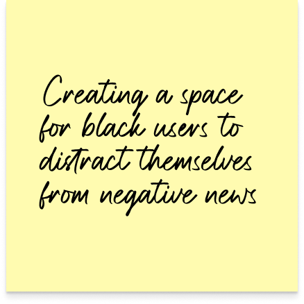
The visual system emphasizes warmth, softness, and presence. Using color, typography, and imagery to counterbalance the intensity of external narratives.